Three races. Three towns. One bold new identity.
The Challenge
Create a distinctive brand identity for the Mid Sussex Marathon Weekend that captures the energy of the event and brings its three races together under one cohesive visual identity.
The Idea
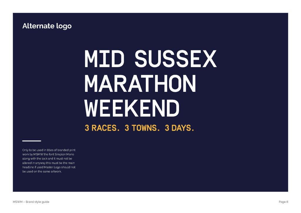
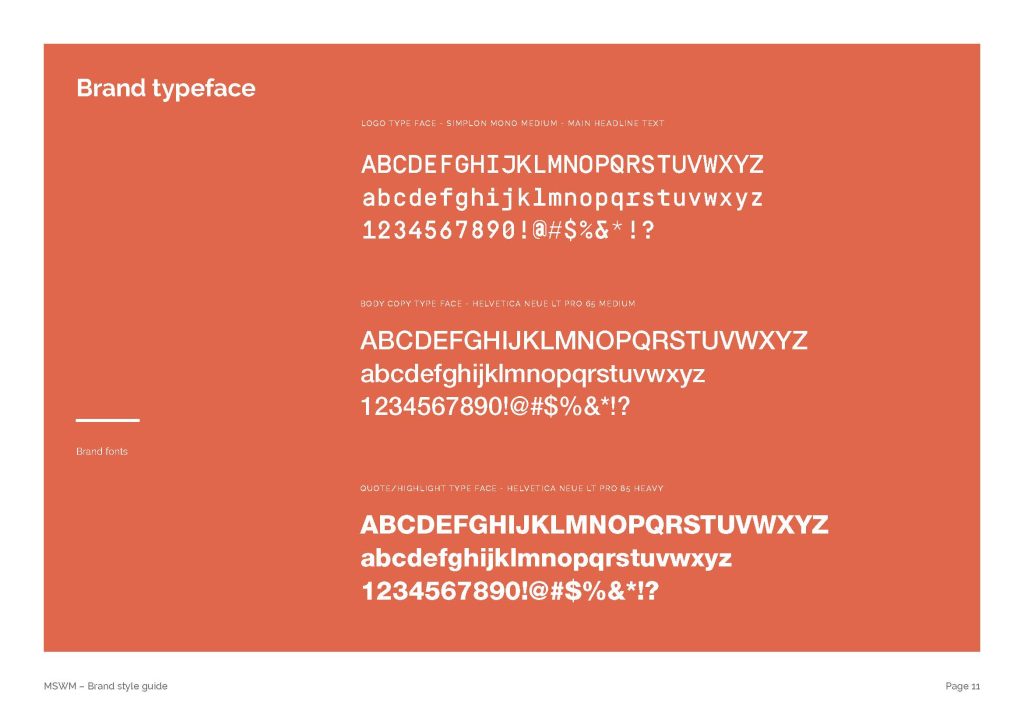
A brand built around movement, momentum and community. The new logo uses a bold typographic style and a stepped graphic motif to create a sense of progression, reflecting the challenge of the race and the journey every runner takes.
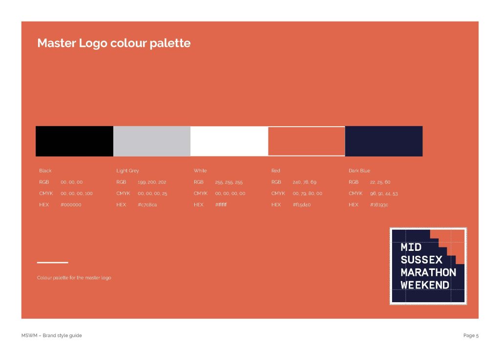
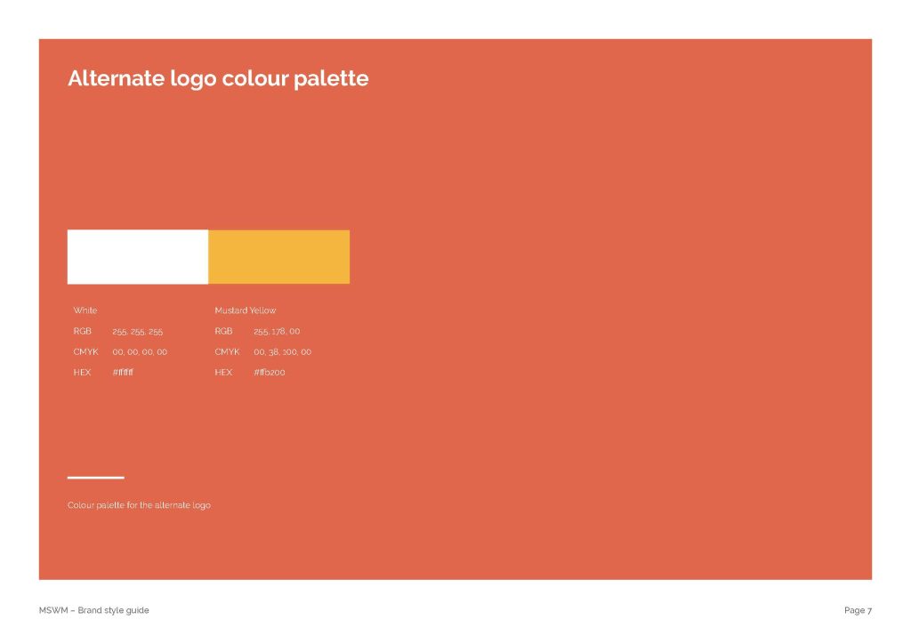
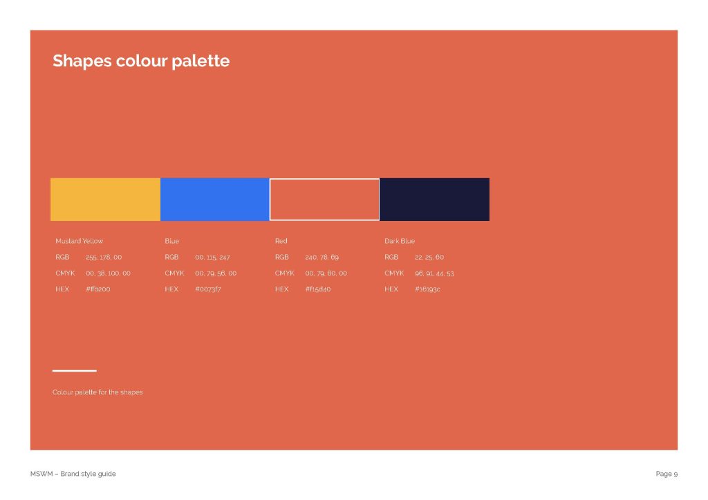
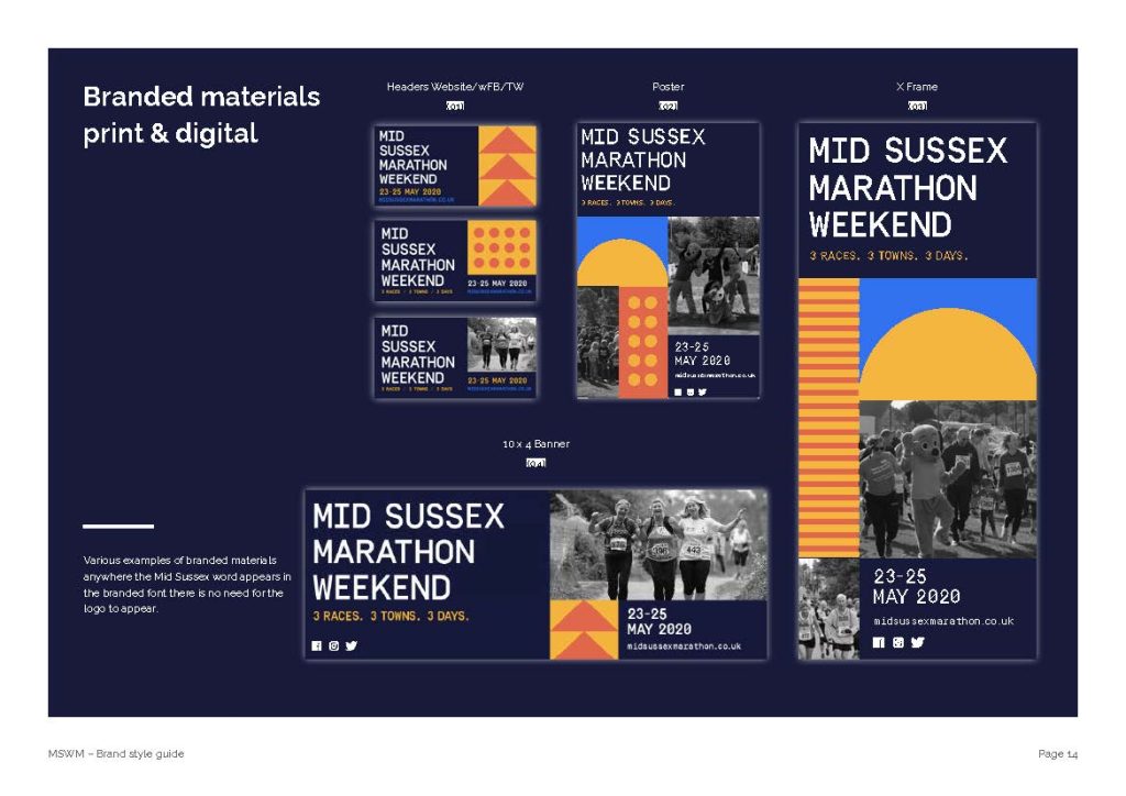
A vibrant orange and deep blue palette delivers contrast and visibility, while a flexible graphic language gives the identity its own recognisable character.
The Execution
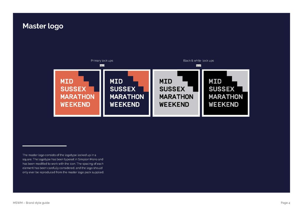
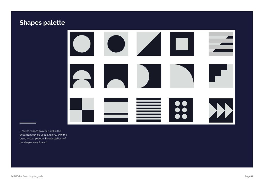
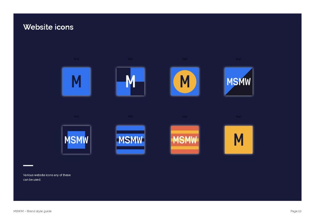
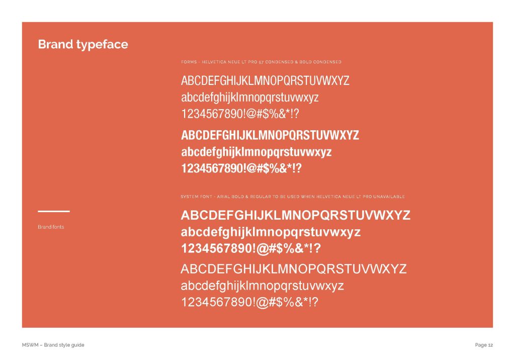
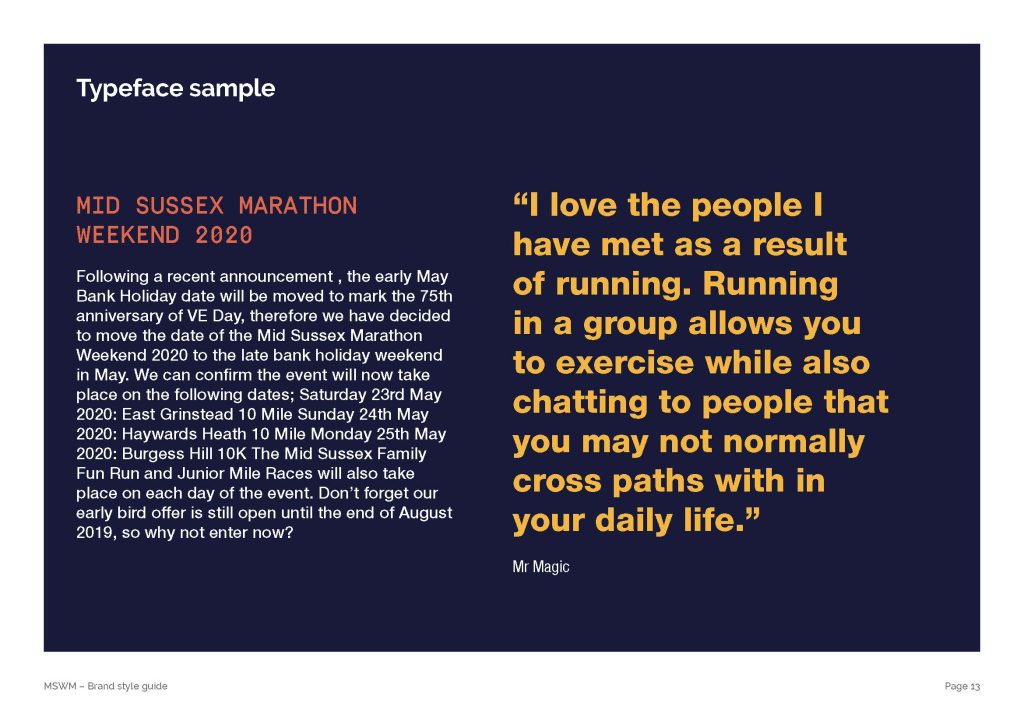
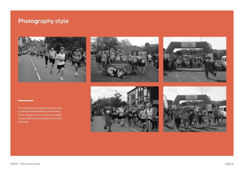
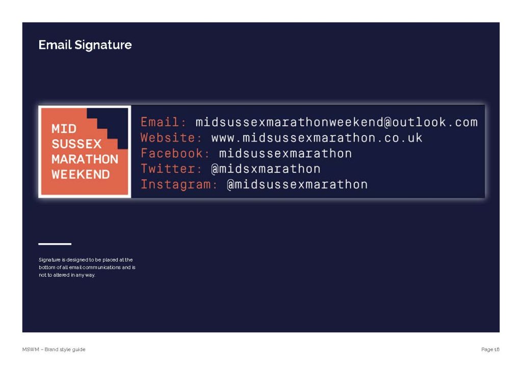
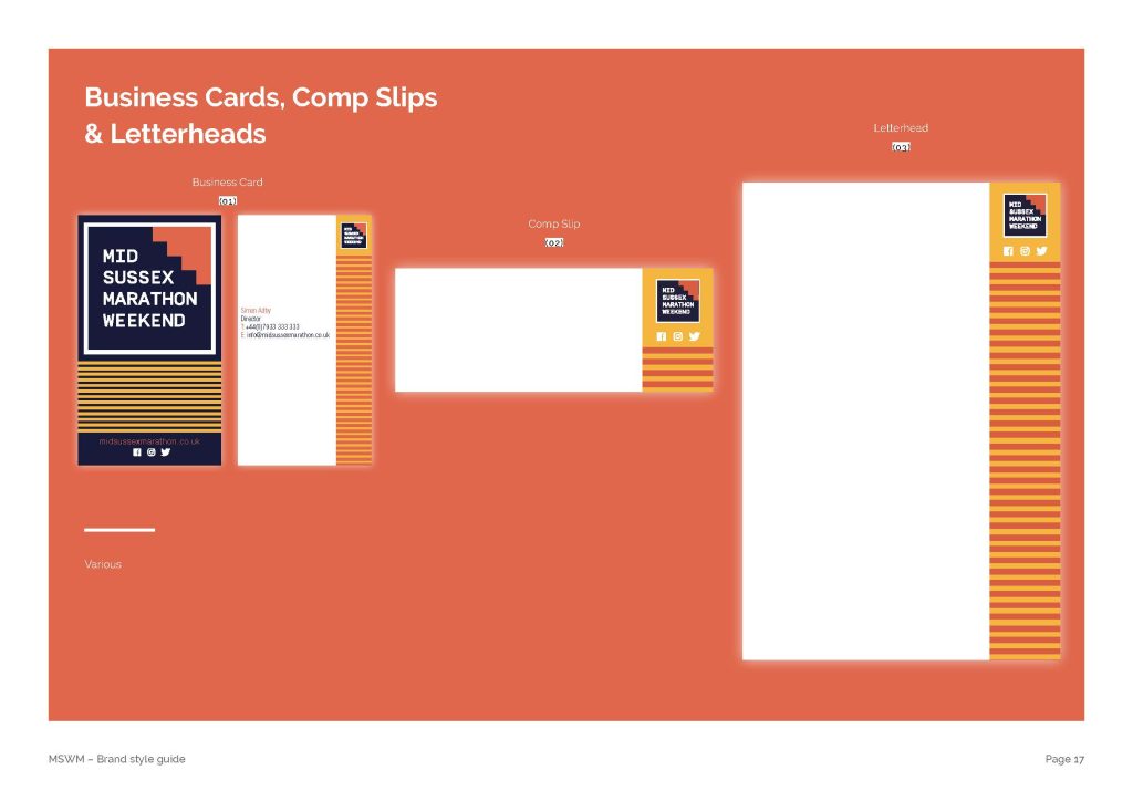
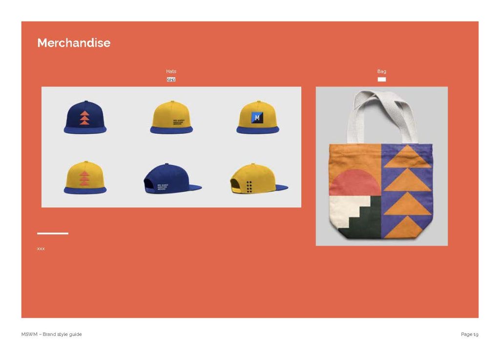
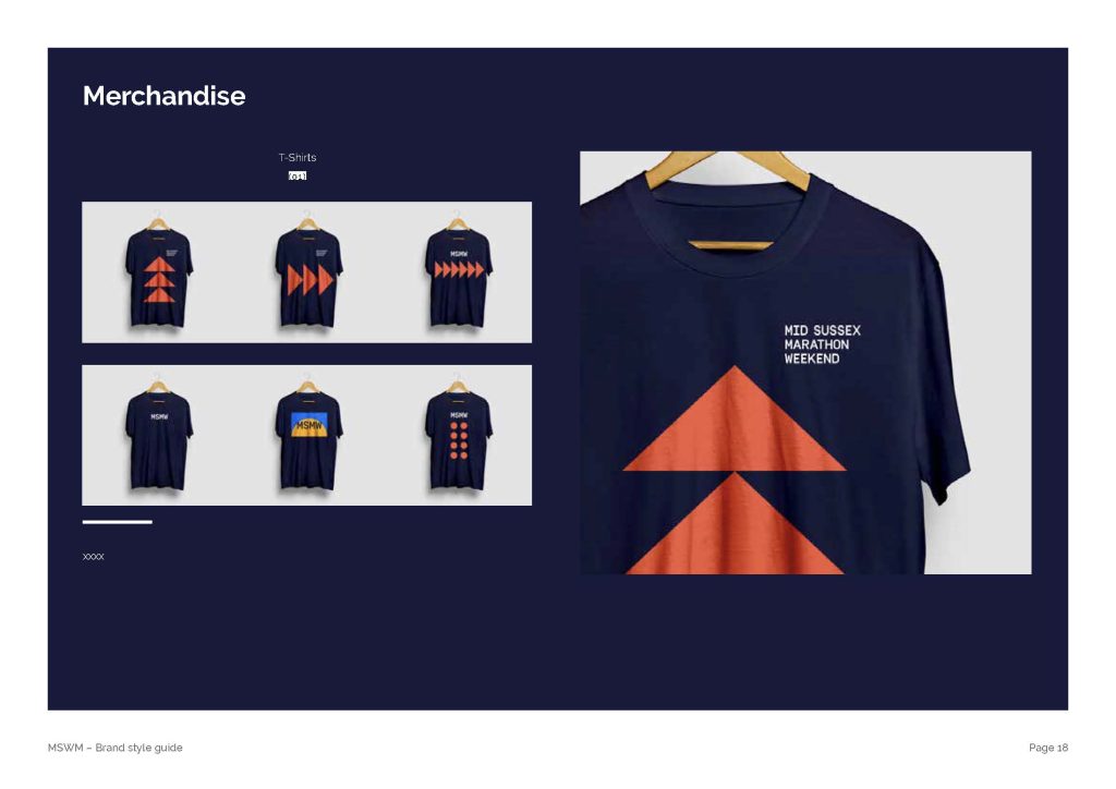
I developed the rebrand from the new logo through to a complete visual identity system, including colour palettes, graphic elements, alternate logo versions, digital icons and brand guidelines.
The system was designed to provide consistency across brand touchpoints while giving the event the flexibility to communicate with runners, supporters and local communities.
The Outcome
A confident, contemporary identity that unites the weekend’s three races under one recognisable brand, celebrating the energy of running and the community spirit at the heart of the event.
My Role: Brand Identity, Logo Design, Art Direction, Graphic System and Brand Guidelines.