RAYRAYS Rum Punch
Brand Guidelines | Visual Identity | Art Direction | Campaign Design
Bringing flavour to life.
RayRay’s Rum Punch is a bold, fruit-led drinks brand built around vibrant flavours, tropical energy and unapologetic personality. The challenge was to create a distinctive visual identity that captured the spirit of the brand while establishing a consistent look and feel across its product range and marketing communications.
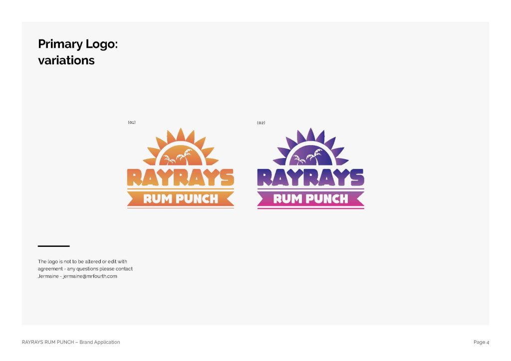
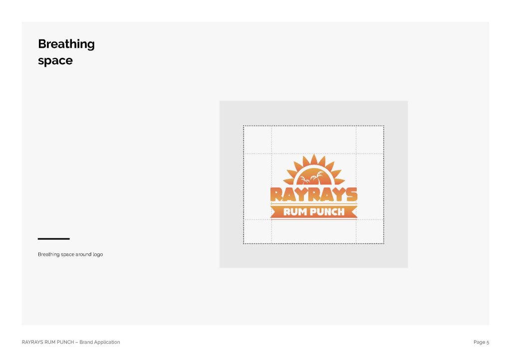
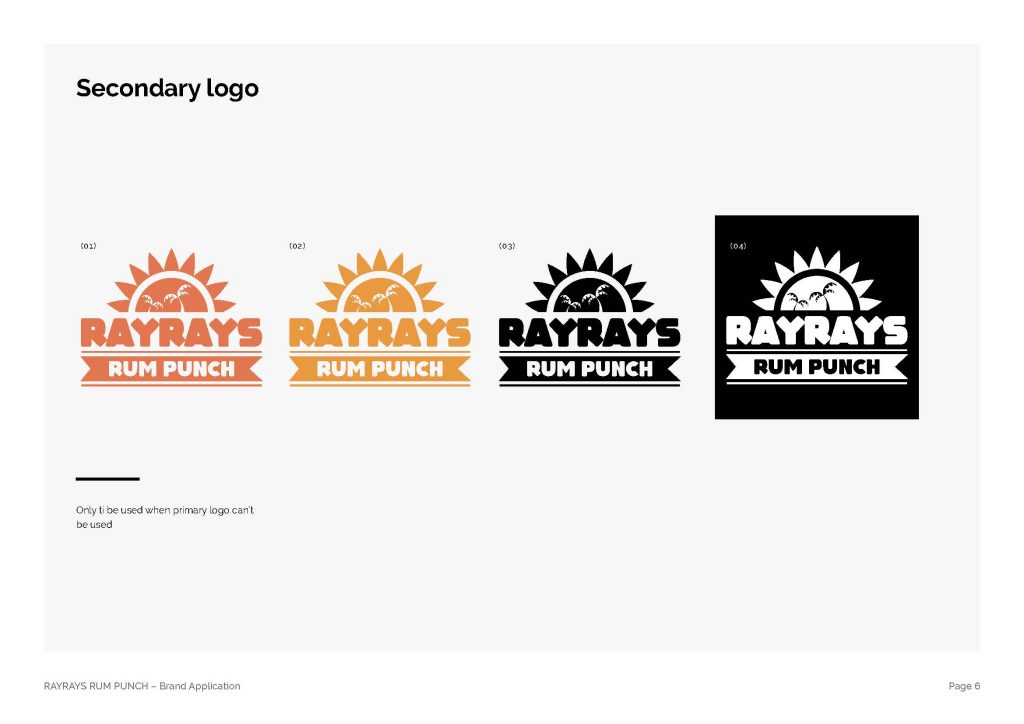
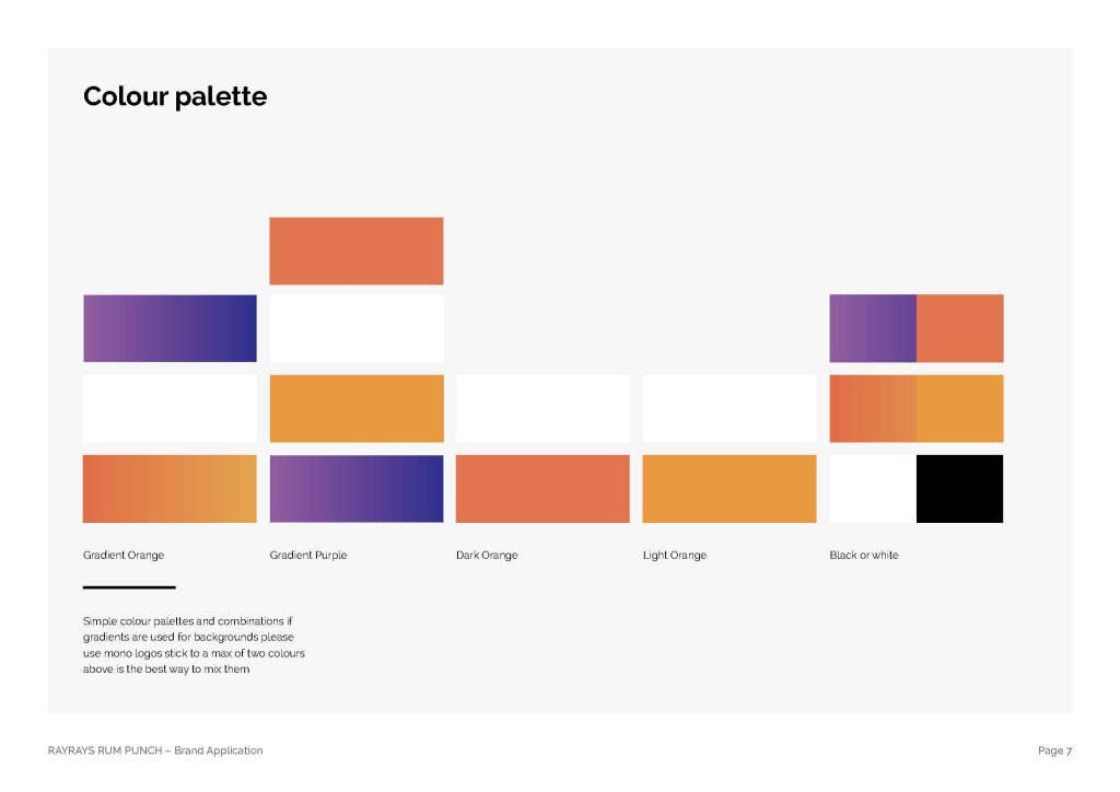
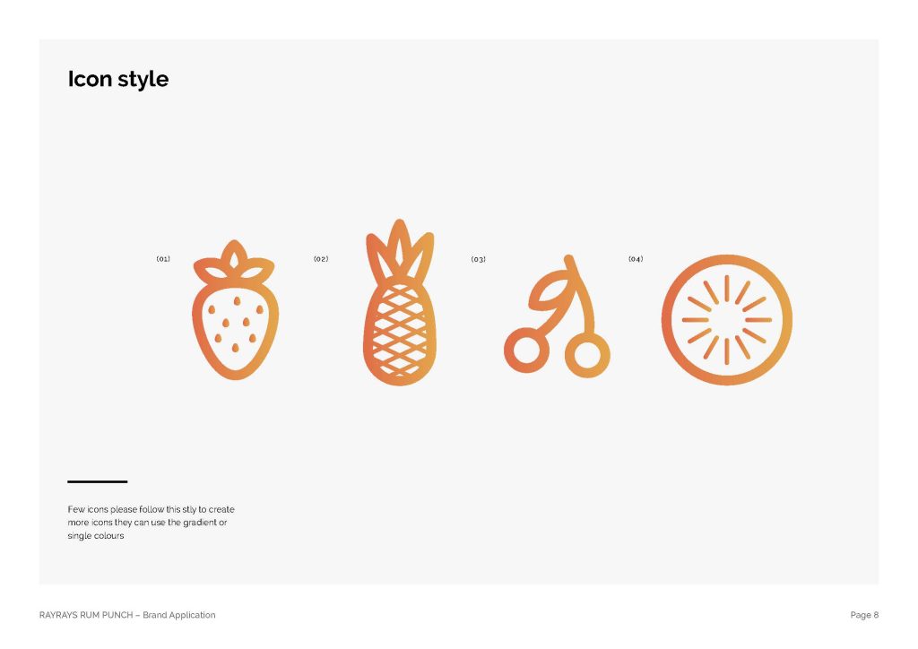
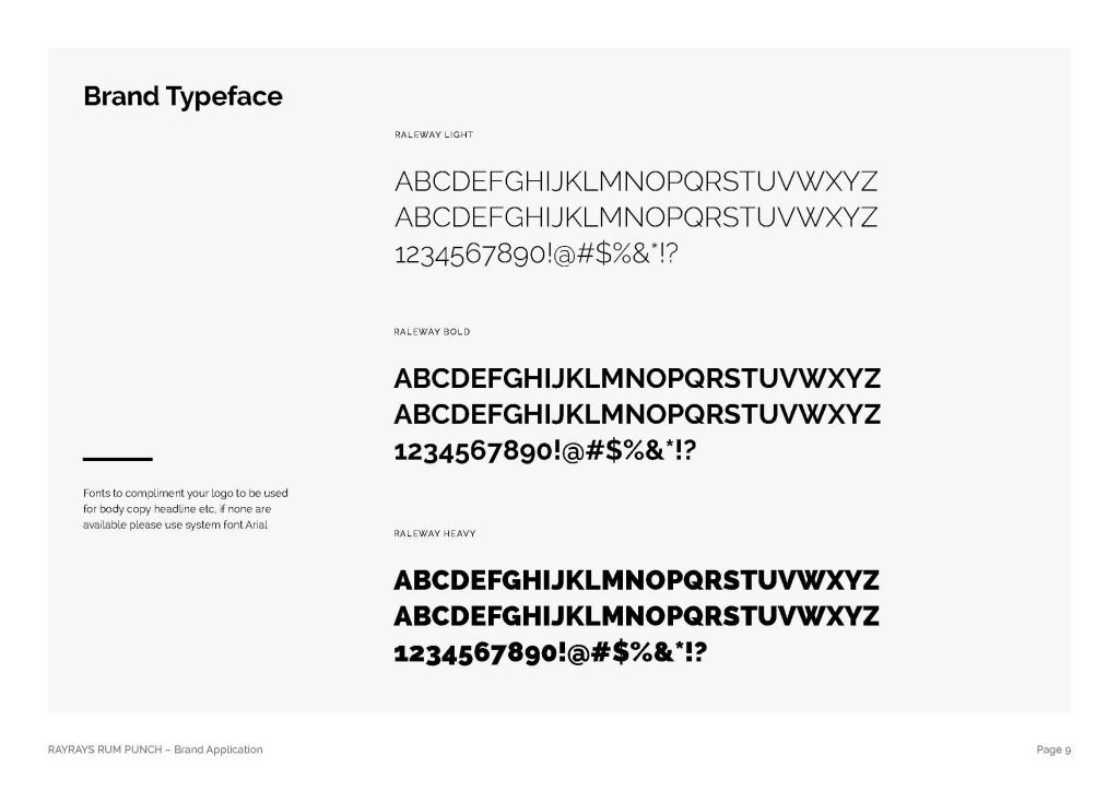
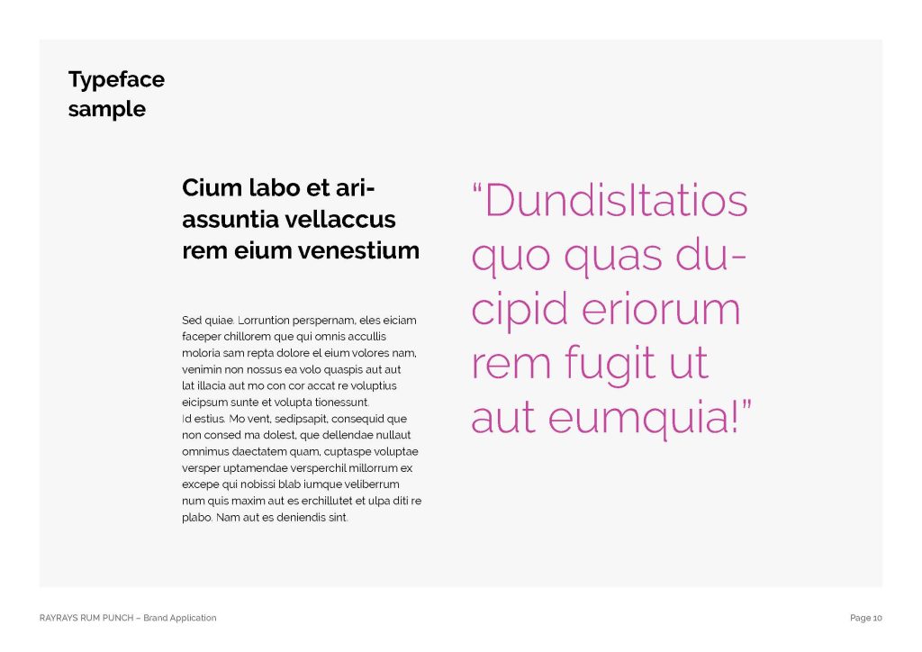
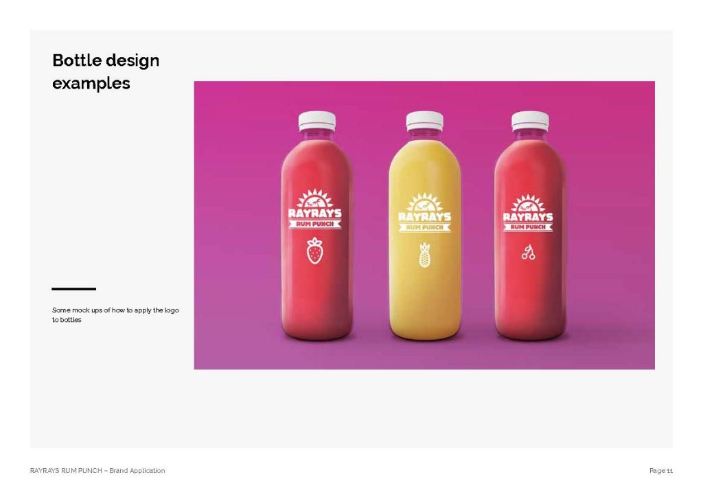
I developed a brand guideline system that brought the identity to life through a confident use of colour, bold typography, distinctive brand assets and flavour-led visual storytelling. Each variant was given its own personality through a dedicated colour palette and fruit cues, while the core branding remained consistent to create a recognisable family across the range.
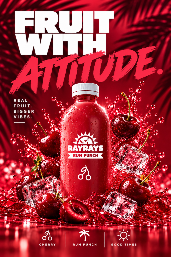
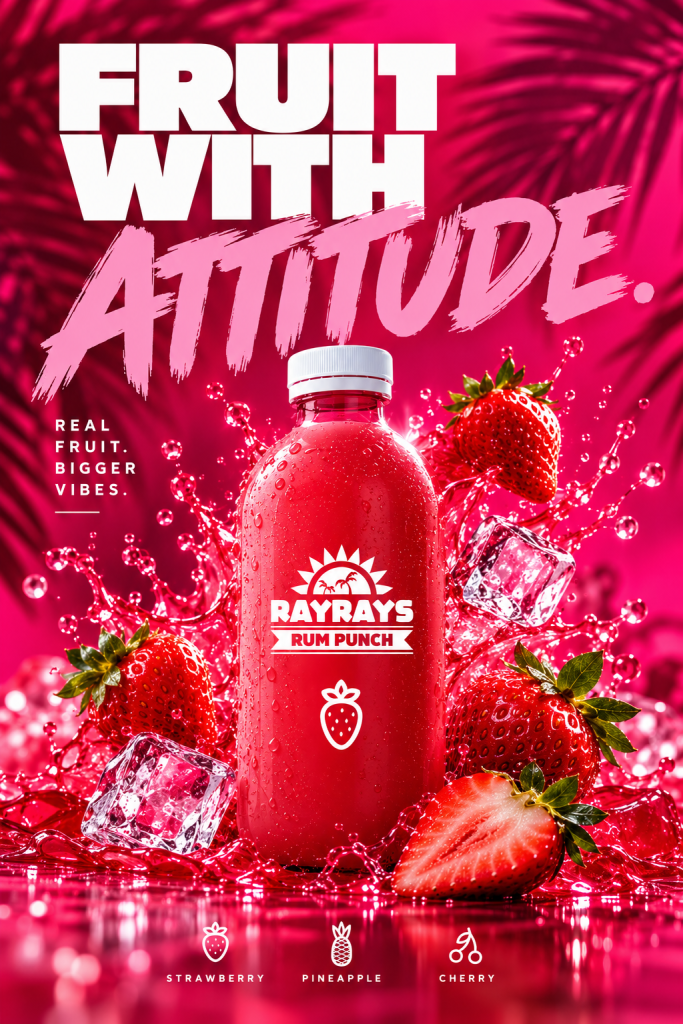
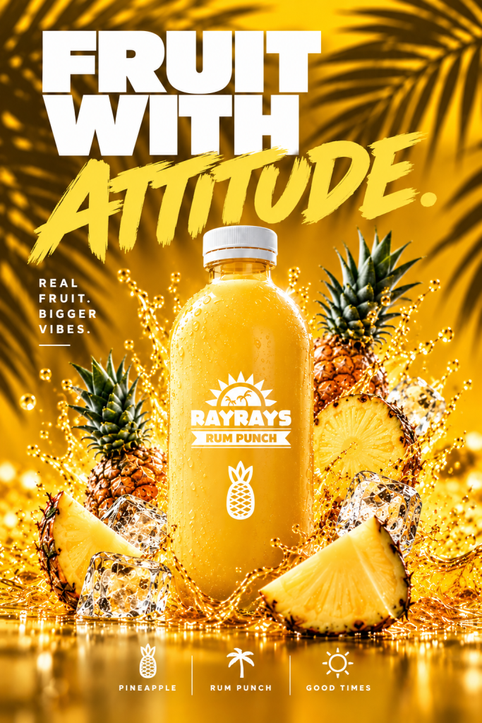
The art direction focused on high-impact product imagery, glossy finishes, dynamic liquid splashes, fresh fruit and tropical influences. Combined with punchy headlines and strong graphic layouts, the approach created a visual language designed to stand out across advertising, social media, promotional materials and retail touchpoints.
The result is a cohesive brand world that balances consistency with creative freedom, giving RAYRAYS Rum Punch a distinctive personality and a scalable visual framework for future campaigns.
The outcome: A clear, adaptable brand guideline system that connects product, personality and promotion through one bold and recognisable identity.