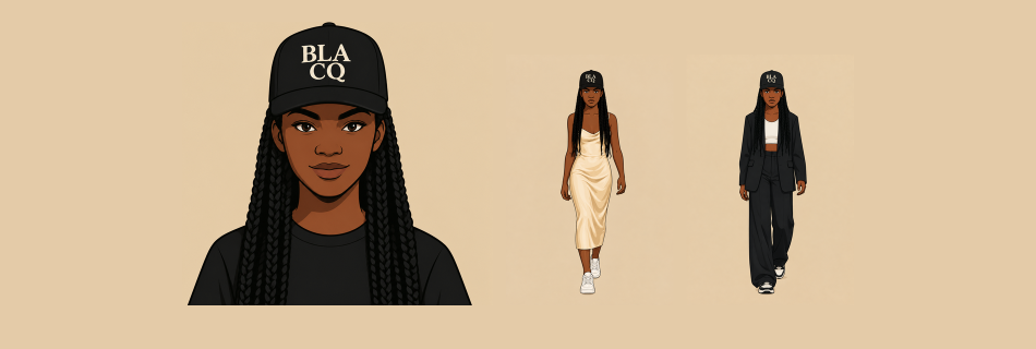
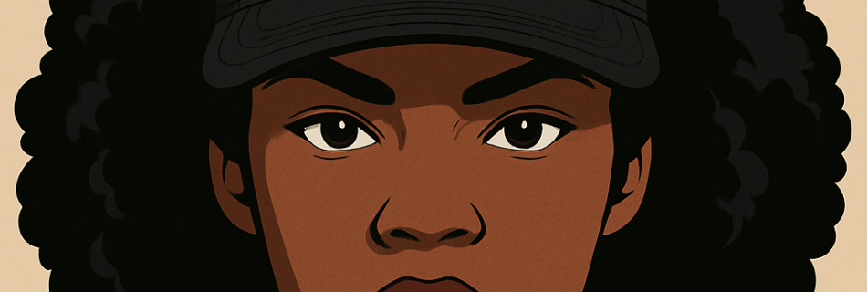
Vee started as an idea. A character for BLACQ that could carry the brand beyond a logo. Not a mascot. A personality. Her own look, her own energy, her own way of showing up. Her signature cap, BLA over CQ. Long braids. Two looks. The cream dress with white trainers, and the black tailored suit. …
Read more “Vee – BLACQ Character Concept”
There is no excerpt because this is a protected post.
There is no excerpt because this is a protected post.
RAYRAYS Rum Punch Brand Guidelines | Visual Identity | Art Direction | Campaign Design Bringing flavour to life. RayRay’s Rum Punch is a bold, fruit-led drinks brand built around vibrant flavours, tropical energy and unapologetic personality. The challenge was to create a distinctive visual identity that captured the spirit of the brand while establishing a …
Read more “RAYRAYS – RUM PUNCH”
There is no excerpt because this is a protected post.
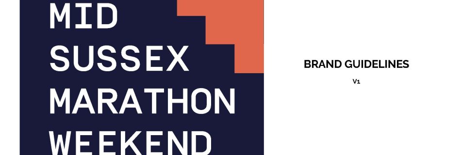
Three races. Three towns. One bold new identity. The Challenge Create a distinctive brand identity for the Mid Sussex Marathon Weekend that captures the energy of the event and brings its three races together under one cohesive visual identity. The Idea A brand built around movement, momentum and community. The new logo uses a bold …
Read more “MID SUSSEX MARATHON WEEKEND REBRAND”
This series was created as a visual extension of the BLACQ clothing brand. Not just product, but people. Identity. Energy. Every character is dressed in BLACQ. Same brand, different energy. The idea was simple. Show how one brand can move through different personalities without losing its identity. The clothes stay consistent, the people bring the …
Read more “BLACQ Characters Series”
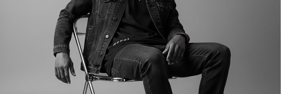
This series was built to strip everything back. No noise. No distractions. Just people and presence. Every subject is wearing BLACQ. Same brand, different attitude. Shot in black and white to focus on form, texture and character. It removes the extras and puts all the attention on posture, expression and energy. You feel the person …
Read more “BLACQ and White Series”
There is no excerpt because this is a protected post.
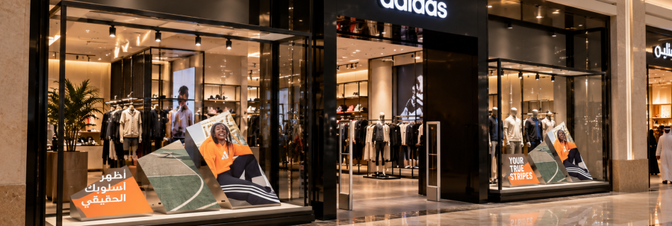
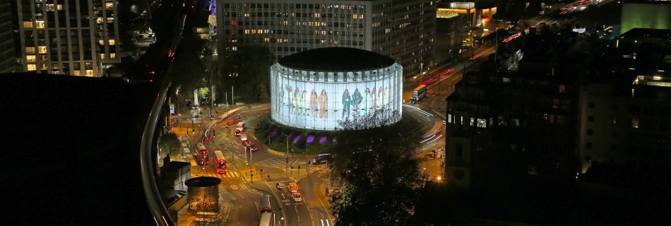
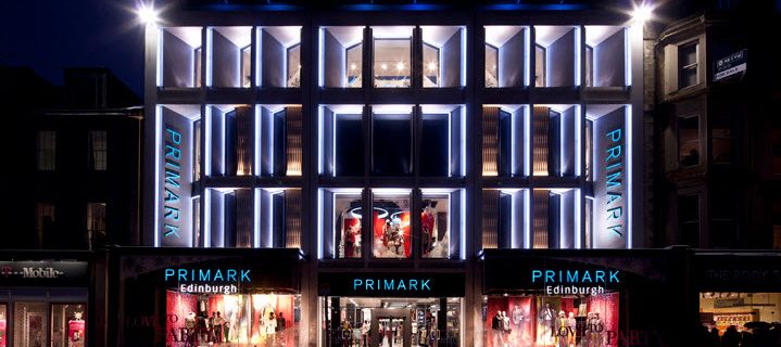
Worked across retail campaigns for Primark, collaborating closely with store teams, PMs and visual merchandisers to design how creative lived within physical retail spaces. From window displays to in store graphics, the focus was always creating impactful customer experiences that balanced creativity with practical execution.